Our society is digitalizing at a rapid pace. Banking services, managing your insurances, applying for benefits, it all happens online. You might order your food, groceries, your next smartphone all online, having it delivered to your doorstep.
On the one hand, these changes make our lives easier. Sending a payment request after dining out, registering at the municipality after moving, or filing your taxes, you can do it all online, anywhere and at any time.
On the other hand, not everyone can equally participate and benefit from this change. For our generation, navigating this digital world comes naturally or is easy to learn. For others, it doesn’t come as easily. And for people with disabilities, it is a whole lot harder.
In the physical world, we make adjustments for them through measures such as slopes next to stairs, braille on elevator buttons instead of just numbers, tactile paving, and accessible toilets. Online, this isn’t always the case.
Digital accessibility, or a11y for short, tries to solve this problem. The Netherlands has signed the UN Convention on the rights of persons with disabilities in 2016, which has been ratified through amendments tot the Dutch law Wet gelijke behandeling op grond van handicap of chronische ziekte (Wgbh/cz). This law now includes digital goods and services. Additionally, the European Accessibility Act came into effect in 2016. This was then ratified in the Netherlands as the Tijdelijk besluit digitale toegankelijkheid overheid.
These laws together require companies and (semi) governmental organizations to provide their goods and services in an accessible manner.
Keyboard accessibility
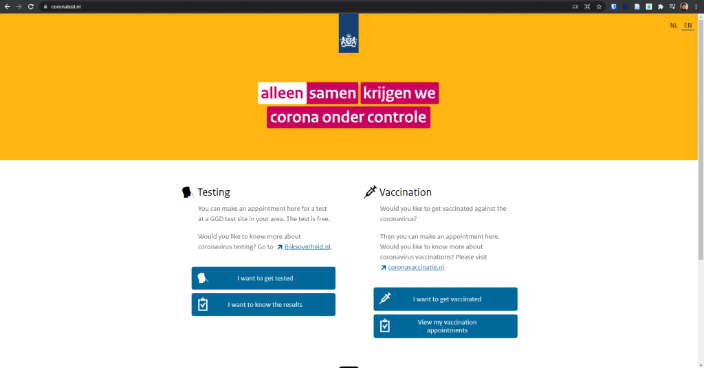
As an example, let’s take a look at the corona test website. You may have used this site yourself, to make a test appointment, check the result, or for a vaccination appointment. For the sake of the experiment, let’s pretend we are unable to use our mouse and have to navigate the site with just our keyboards. We did a corona test and we want to see the result.

Without a mouse, navigation happens mostly through either tab, page up or page down, or your arrow keys. To get to our results, we need to click on “I want to know the results”, so let’s tab to it.
As we tab, we see a dotted outline around links. When we tab to a button, it gets a slightly different shade of blue. But wait. Did we just tab to the bottom button first, instead of the logical visual order, which is top to bottom?
That order is odd and counterintuitive, but we hit enter anyway. We log in with DigiD, which should go smoothly even with just the keyboard.
Once logged in, we are shown our most recent test result. This is user friendly as it spares us a click and just gives us the information we want immediately. As we go through the page, at the end, there is a link that says “Have you been tested more often? Click here to see the results.” so let’s tab to it and hit enter.

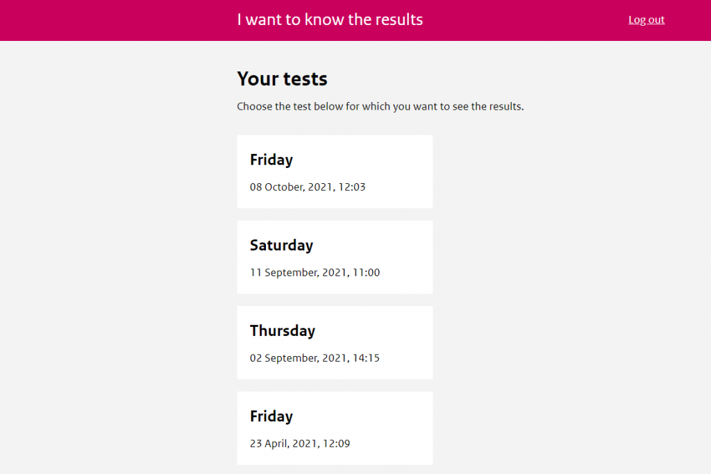
We are shown a list of previous tests, that you should be able to click on to see their results. Except you can’t. Not without a mouse.
If we tab on this page, we get tot Log out, and if we tab again, we skip all the way to “About this website”. In other words, there is no way for users without a mouse to see previous results. This is because of the code behind this, which doesn’t make these cards a link or a button, and programmatically handles the clicks, but does not take into account keyboard accessibility at all.
Consequences
What I wanted to show through this example is that even the new websites made for or by the government aren’t always accessible. It is disheartening that even one of the main functions of the website – showing the results of previous tests – is not accessible for everyone. Despite being disappointing, it fits the pattern.
There is an online registry with all statements of accessibility of Dutch (semi)governmental organization. This is part of the requirements set by the Tijdelijk besluit mentioned earlier. In this registry, you can look up to what extent the websites and (mobile) applications developed for and by these organizations meet the standards set by law.
Moving to a more digital society without taking the proper measures to include everyone to actively participate in and contribute to these digital spheres is to exclude a part of the society.
We must not forget about this group, and actively work to make sure they are included too. We might not be able to do this on the large scale of government services, but we can do so on our own blogs.
Responsibility
We as content creators are equally responsible to create accessible content. One of the things we can (and should) do, is adding alternative text to our images. This is descriptive text that is read to users of assistive technology such as screen readers.
Other things we could do includes but is not limited to:
- Using headers and a clear post structure
- Making sure to use clear link text (instead of “click here” or “link”)
- Adding closed captions to video’s,
- Providing a transcript of podcasts.
The example I have shown is just one of many. One thing I have started doing is tabbing any new websites I visit. See if they have a “skip link”, a link that allows you to skip the menu and jumps to the main content. Other quick tests include navigating the menu with just the keyboard or checking for contrast on the page using the browser Inspector. You might be surprised by how poorly accessible a lot of sites are.
Let’s try to do better together.
Additional resources
Some additional resources to read up on accessibility are listed below.
Who Can Use: A website to check color contrast for your text.
Accessible speaking best practices: Blog post by Deque, a company specializing in accessibility.
Easy Checks – A first review of web accessibility: A quick check to see if the most basic accessibility needs are met.
In this article I didn’t go into the technical nitty gritty, but if you’d like to read more about the standards that need to be met, the Web Content Accessibility Guidelines (WCAG) is a good place to start. Dutch law prescribes conformance to WCAG 2.1 at level AA for websites and apps.


Recent Comments