It is no secret anymore that the streaming service Netflix has practiced personalised user experience through the covers of movies and TV-shows. Not only does its algorithm creates a selection of “Recommended For You”, based on the watch history, it also uses covers that it thinks would be more appealing to the viewer. Naturally, visual elements can play a crucial role in our selection of the movie or a tv show. After all, it is the first point of contact between the viewer and the item on the Netflix’s library.
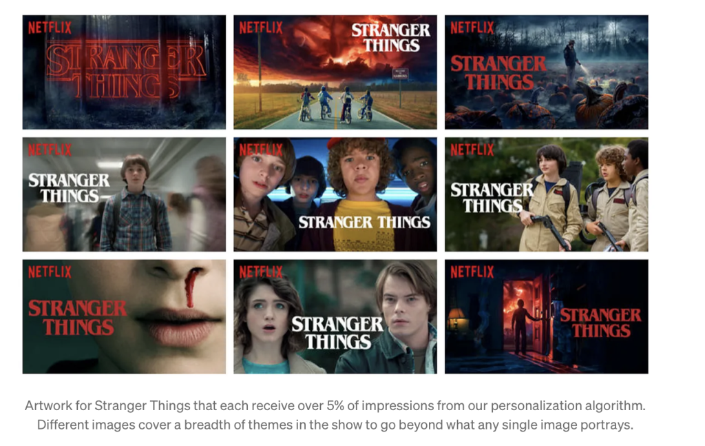
Few years ago I came across this article published in Netflix TechBlogs. It explains how Netflix uses their algorithm to shape an immaculate personalised user experience. The team of writers of the article explored the different options for a cover of a single show. Here is the results they got individually by searching the well-acclaimed TV show “Stranger Things”.

While, I would not say that there are big noticable differences between all of these thumbnails, we can point out, for example, the thumbnail with Ghostbusters outfits, which could be appealing to someone who is a fan of the original movies. Another thumbnail that does not fit in as well is the center bottom one. We see two characters, who potentially could be romantically involved, thus being more appealing to someone who likes to consume media with romantic storylines.
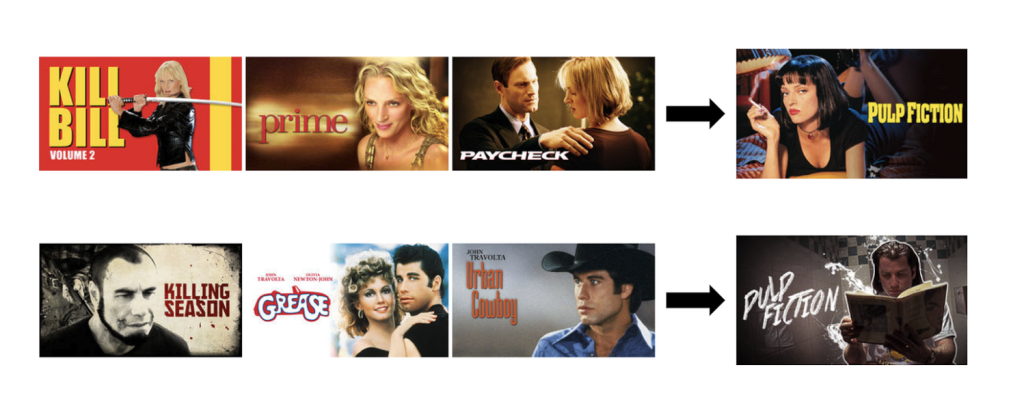
Further on in the article they give an interesting example, using the movie “Pulp Fiction”.

As we can see, the same content may have different covers for various users, each designed to appeal to their specific preferences. For instance, on the first row we can see that a person, who watched three movies starring Uma Thurman, will see “Pulp Fiction” with a thumbnail that only has Uma Thurman. The bottom row displays a similar principle with the actor John Travolta. The thumbnail shows the same movie – “Pulp Fiction”, yet the thumbnails are presented taking into account the user’s watch history.
Given the fact that, as of 2023, Netflix is available in more than 190 countries, it is fair to assume that its audience is diverse, with a wide range of tastes and cultural backgrounds and to cater to this element of the market, they use customisation of thumbnails. Operating globally also calls for content in multiple languages and following the trends of the local population, thus even more adding to the angle of personalised watching.
Why does it matter?
While cover personalisation overall is a harmless practice, it is important to keep in mind inclusivity and representation. Automatisation can unintentionally reinforce biases and stereotypes, because similarly to other platforms – it will show you content that it thinks mostly aligns with your values and/or beliefs. Of course, this is not always a bad thing, however it can be limiting to not allow yourself to experience diverse perspectives and genres.
P.S. It is quite fun to look at other’s thumbnails and compare them, in a way you can tell what type of movies (including genre, storylines, actors) the person enjoys watching and perhaps that can tell you a teeny tiny bit more about the person. 🙂


Recent Comments