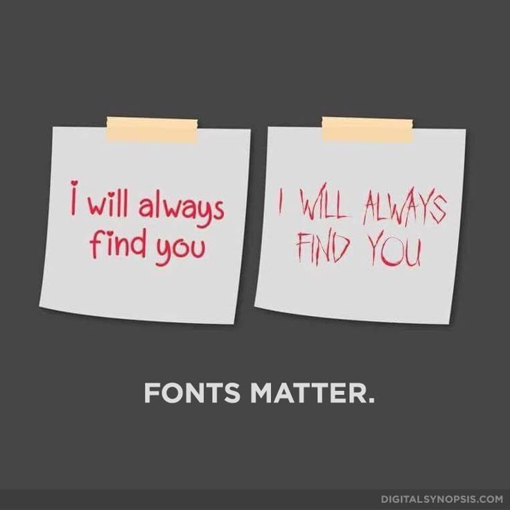
We encounter them every day: letters and texts. On paper, on your screen, in books, on storefronts and labels. We see them every day, yet we hardly ever think about their impact and the design process. During my study in Advertising, I learned how the design of letters, typography, can influence people’s emotions and perspectives. It is never just a text, a sentence, or a word. In ‘The Medium is the Message’, Marshall McLuhan argues that it is the medium of how a message is conveyed that is initially the message instead of the content of that message.1 Rather than continuing his line of thought about how different media shape the message, let’s zoom in more to its visual design and examine its role in the context of a museum.
A Brief History
It is well-known that Johannes Gutenberg’s invention of the printing press in the 15th century was a significant catalyst in the technical development of communication.2 It has allowed for an efficient distribution of a message, and it was more efficacious than the time-consuming handwriting. The first typefaces were designed to mimic handwritten manuscripts, while later styles were developed as a response to evolving tastes and printing technology.3 The purpose of typography is to enhance the readability of written language, make it visually appealing, and communicate a message in the right tone and style.4
Typeface vs Font
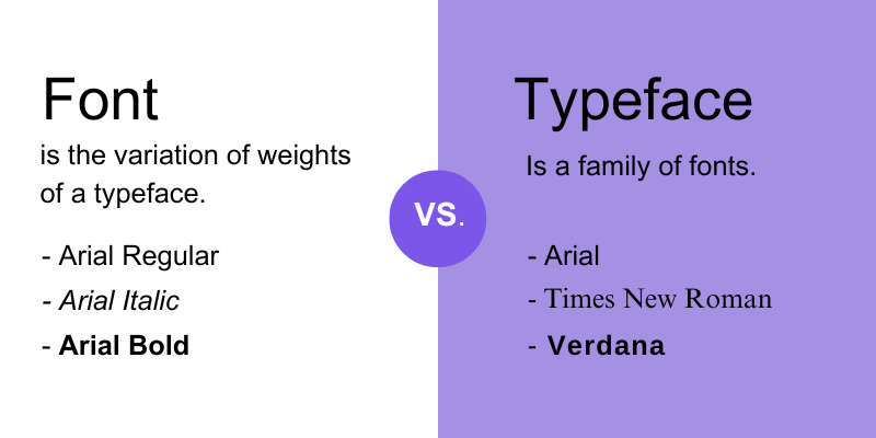
Friet / Patat or Typeface / Font, these words refer to the same thing, right? Well, not exactly. In the case of the latter, there is a significant difference that many are not aware of.
‘Typeface’ refers to a particular style of lettering, while ‘Font’ refers to a typeface’s variation.5
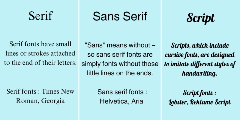
There are now thousands of typefaces since we entered the digital era, and it is still in progress. Designers and creative minds are still experimenting and designing new typefaces. To make this gigantic forest of choices a bit more comprehensible, we can divide it into three major styles: serif, sans serif, and cursive.6 The global availability within content management systems and website builders makes it easier to test and experiment with which style fits best with a brand’s design and psychology.7 In other words, which style that best visually communicates certain ideals and values.
Serif, Sans Serif, and Script
Serif
The original font style, whose history can be traced back to manuscripts and other physical media.
- Associations: traditional, professionalism, elegant, reliable.
- Examples: Times New Roman, Georgie, Garamond.
- Best used for: Printed books, blogs, formal invitations.
Sans Serif
‘Sans’ meaning ‘without’, thus without those fancy extra adornments you see with serif. It creates a minimalistic and clean font.
- Associations: simplicity, modernity, clarity, straightforwardness.
- Examples: Helvetica, Arial, Futura.
- Best used for: Digital apps, websites, logos.
Script
Despite its unsuitability for body text due to legibility, this font style is perfect if you want to add a personal and creative touch.
- Associations: uniqueness, emotional, luxurious, elegance.
- Examples: Pacifico, Tangerine, Brush Script.
- Best used for: Invitations, formal events, headlines.
Font Psychology Factors
Besides the associations these typefaces bring, there are other factors that should not be overlooked. For example, colour, hierarchy, font pairings, or emphasis by making a text bold, underlined, or strikethrough.
In colour psychology, there are certain feelings associated with particular colours.8 It should be noted that these feelings are not always in the same line. Think of the colour red; some may feel a sense of love and passion, while others associate it with anger and danger. Brands, companies, and other institutions use strategies regarding typography to connect with their audience and to voice their messages. It can make or break you. A wrong design choice can lead to misunderstanding or a repulse from an audience, and this gives a museum curator a demanding challenge.
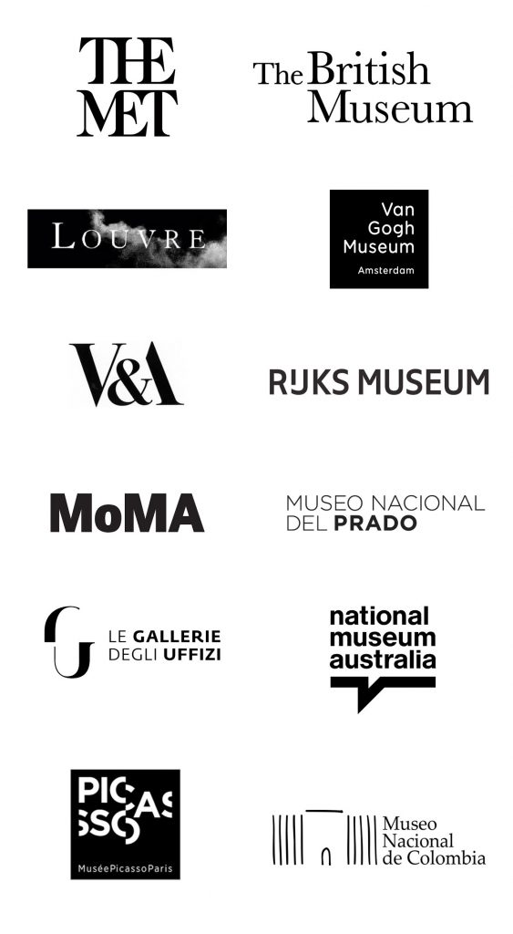
Typography in museums
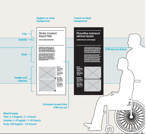
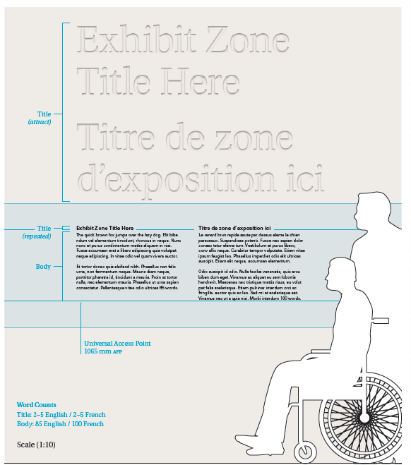
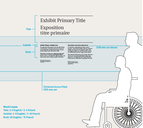
Museums are filled with works of art, but they do not come without additional text. Whether it is to explain an exhibition, a work of art, or simply to navigate visitors towards the toilet. A museum curator not only has to carefully select their choice of words, but also their visual design. As we have seen, a Serif Font conveys tradition and elegance. Their subtle strokes are reminiscent of a manuscript’s printed pages and do well with classical art. Contrary to the Sans Serif Font, which connotes modernity and clarity, and is better suited for contemporary works of art.
Moreover, keep in mind that visitors come to museums for the artworks. Therefore, a small, long, dense text in a decorative font may signal luxury and intimacy; it is likely that visitors will not spend much time reading such text. For a text to be read in a room full of attention-grabbing artworks, it needs to stand out without drawing too much focus. This can be achieved by experimenting with hierarchy, space, line length, contrast, and colours.
Conclusion
Typography in museums tells visitors not only what to read, but how to feel while reading. It not only transfers the content of the text, but also feelings and emotions. The most effective typography is not the boldest or the most ornate; it is the most empathetic. Somehow demanding your attention while serving as an asset for the works of art on display. The next time you see any text, consider how its visual design makes you feel. Be awed by the art, feel inspired to create a new font yourself, and feel the emotional impact it communicates.
────── ⋆⋅☆⋅⋆ ──────
Resources
- McLuhan, Marshall. “The Medium is the Message,” in Understanding Media: The Extension of Man (1964). ↩︎
- “Treasures of the McDonald Collection – Special Collections & Archives Research Center,” n.d., https://scarc.library.oregonstate.edu/omeka/exhibits/show/mcdonald/incunabula/gutenberg/. ↩︎
- Gert Svaiko, “Font Psychology: Here’s Everything You Need to Know About Fonts,” Designmodo, February 12, 2025, https://designmodo.com/font-psychology/#historical-context-of-font-psychology ↩︎
- Kateadamson, “The Importance of Typography in Design – Grinning Graphics,” Grinning Graphics (blog), January 22, 2025, https://grinninggraphics.co.uk/the-importance-of-typography-in-design/. ↩︎
- Sharon Hafuta, “Never Be Confused by Typefaces Vs. Fonts Again: Here’s How They Differ,” Blog Wixel (blog), September 1, 2025, https://www.wix.com/wixel/resources/typefaces-vs-fonts. ↩︎
- Kateadamson, “The Importance of Typography in Design – Grinning Graphics.” ↩︎
- Svaiko, “Font Psychology: Here’s Everything You Need to Know About Fonts.” ↩︎
- There is a large body of research on colour psychology. St. Louis Community College has compiled a list of books for further reference: https://guides.stlcc.edu/color/psychology ↩︎
- Klok_Pm, “Grand Egyptian Museum Branding: The Design Process Beyond the Controversy | Tarek Atrissi Design | the Netherlands,” Tarek Atrissi Design, July 31, 2018, https://www.atrissi.com/grand-egyptian-museum-branding-the-design-process-beyond-the-controversy/. ↩︎

I really enjoy this connection between McCluhan’s ‘the medium is the message’ and typography in museums.
The in depth explanation of different elements of typography was a welcome change from many blogs which just give a general overview, and I loved how much I learned from it.
Additionally the connection to museums was clear, even if I would have wanted a little more information on that connection specifically. This was an interesting take I hadn’t considered before, and I can tell you do have a passion for the subject, thought your writing, which is always nice!
Oh my goodness! A comment on my blog. Thank you so much for your time to read it.
Well, museums have to carefully think about their selection of words. To be as neutral as possible and to convey their message as clearly as possible for a large variety of audiences. However, the design of those texts also carries a meaning in itself. Think of which kind of texts or words you highlight, put first or second, etc.
History museums specialised in, say 19th 19th-century art, will use a serif font, while modern museums will use a sans serif font because that’s associated with modernity.
Unfortunately, I couldn’t elaborate more due to the restricted word count, but I hope that this made it more clear?
Again, thank you for reading!
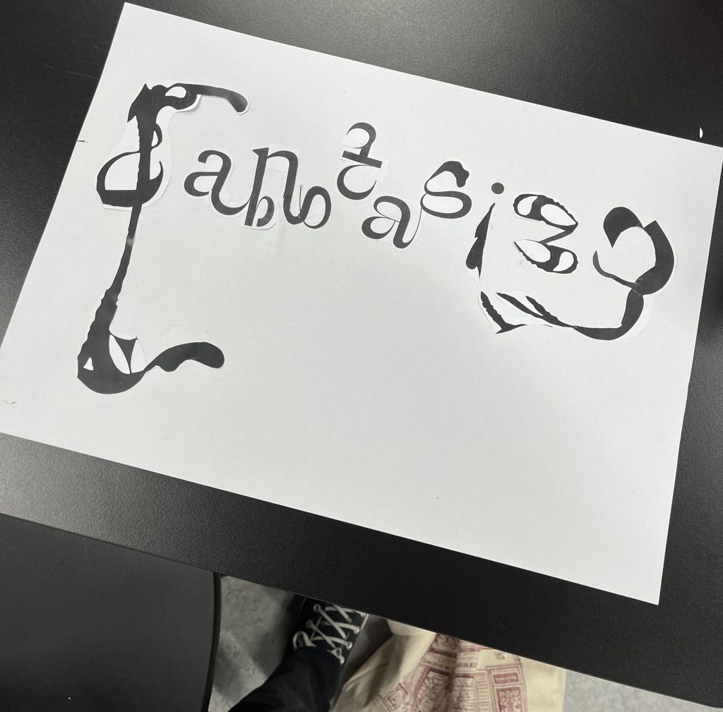
Such an interesting and niche topic! To be honest, it is one of the best blog posts I have ever read. The topic really intrigued me and your communication of it was great. It was laid out nicely in a way that it was easy to understand even with a very limited prior knowledge. Love your use of the first picture, I illustrated your point so well. I immediately then understood what you were trying to explain so nicely in words. Great use of a visible example all through the text!
A fun fact, I wanted to share with you, about different types of Typeface (as I have now learned are not the same as font) is that comic sans is used by many dyslexic people as the variation in the letters makes it easier for the dyslexic brain to comprehend.
As a person who frequently visits museums, I often think about the use of labels, and what they chose to highlight. But from now on I definitely will reflect upon their use of typefaces and which effect it has on me.