Cross my heart and hope to die, I was going to write something meaningful and thought-provoking for this blogpost. The surge in racist attacks on footballers’ social media is a worrying trend, and the professional footballing community’s calls for action from the platforms themselves is a topic worthy of its own essay. Alas, this week I’ve been gripped by the selfish urge to do what’s become second nature to me here in The Netherlands (thanks, unpredictable Dutch weather!) – complain.
Firstly, some context; I’m writing my thesis this semester, and even though it’s only two weeks in, the process has been daunting in its intensity. I, however, am an overzealous planner who’s been doing bits of research since last semester, and am now trying to put together the key definitions and sources. Which brings me to my point – broadly speaking, I’m analysing a number of European Union policies in my thesis, and in my quest to gather all the sources, I’ve come to realise that the EU’s digital presence is kind of a mess.

I’m not referring to the EU’s social media channels here – I think that they’re actually doing a decent job on that front. What I am talking about is the official group of EU websites, under the europa.eu domain. For all its criticisms, one thing that I think the EU does exceptionally well is making its documents available on the internet, in as many of its 24 official languages as possible. And for the most part, its publications website is a wealth of resources for those looking up the nitty-gritty of everything from cultural heritage policies to agriculture regulations – provided you know exactly what you’re searching for. When it comes to the websites of the Commission, the Parliament, and the Council, however – just like the EU itself, they can seem like a complicated, bureaucratic black hole.
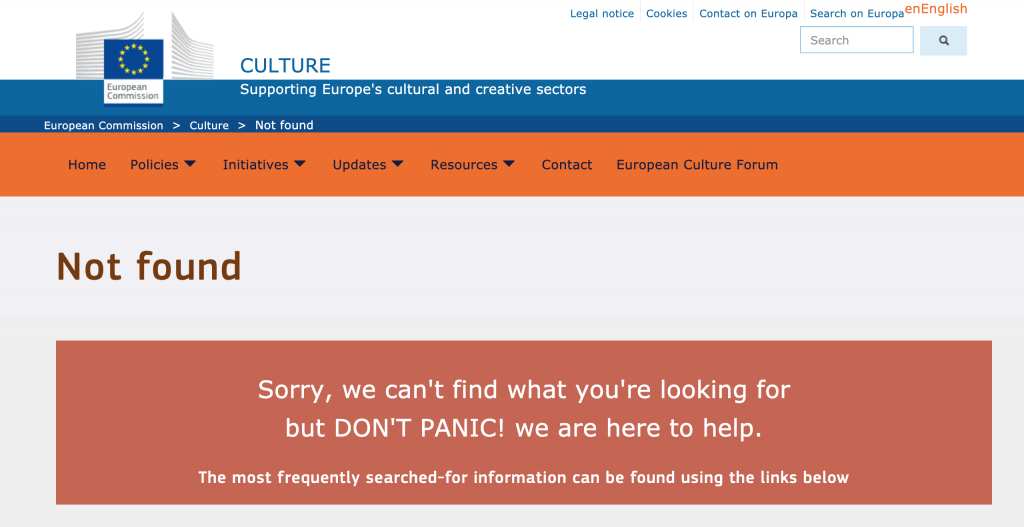
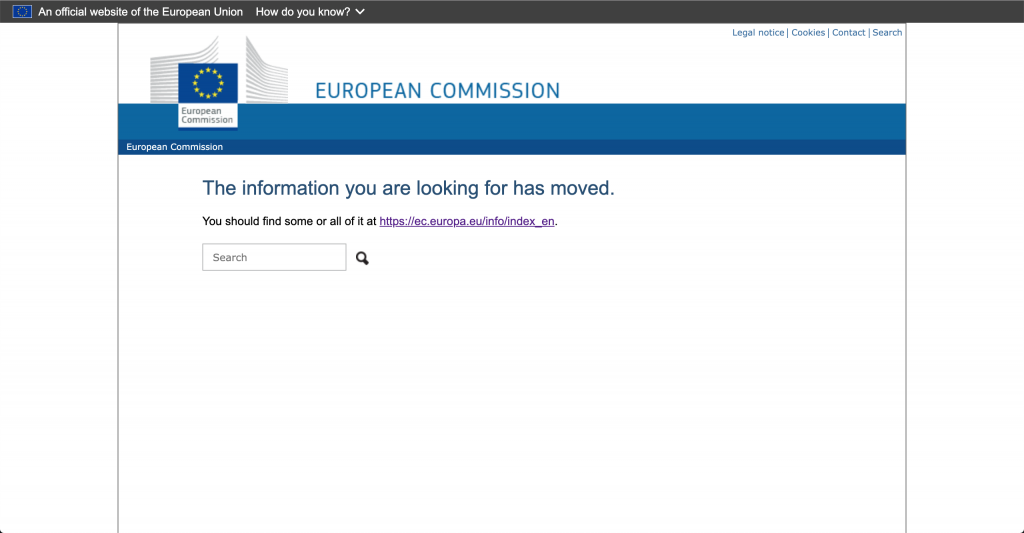
It’s not that the websites are uninformative or archaic. Rather, in publishing information from all its “institutions, agencies and bodies”, the EU websites are veritable rabbit holes of information; one could compare them to Matryoshka doll in their seeming endlessness. This wouldn’t be a bad thing at all, if not for the fact that the websites are an absolute pain to navigate. As previously mentioned, unless you know precisely what you’re looking for, you’re relegated to clicking a bunch of links in the hope that you’ll find something relevant (the search functions only work so well). What comes across as more problematic, however, is the number of dead links and missing webpages you may encounter along the way.

In its quest to streamline its web presence, the EU has inadvertently failed to keep aspects of its websites up-to-date, a sloppiness that I think is problematic for a number of reasons – and not least because the websites should be accessible to anyone and everyone. The EU already suffers from accusations of being beyond the reach of its Member States’ citizens, and the seemingly convoluted presentation of its information online, whether intentional or not, contributes to that image. Although updates have been rolled out across the websites, I’d argue that making a “lite” version of the europa.eu website would make navigation easier for the causal user.
At the end of the day, I’m truly grateful to the people who make access to the EU’s websites, and by extension its information, possible – the time and resources taken to transcribe, translate, and digitise all the documents available are immeasurable. I’m also aware that these complaints could be down my own incompetence when navigating their websites (if I’m getting this all wrong, feel free to correct me in the comments). But even as the EU has taken steps to modernise its websites, I can’t help but wish that there was a better streamlining of its content – and an “advanced search” option would be nice, too.


Hey Amanda,
Cheeky title you came up with!:D
I do agree with what you described in your blog.
I feel like websites are nowadays the forefront of an institution, shop, community.. you name it.
It is often the first thing people see and experience about a certain entity.
If the website then is shitty, it kinda gives a bad first expression…
Dead links on such a website also really is a no-go in my opinion.