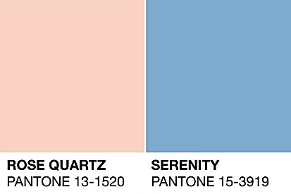
In a world where pretty much everything is commodified or can have a value extracted from it, from usernames to nature, it may not be surprising that colour is now also skewing towards ownership – by the company Pantone.
Pantone began as a collection of colour chips that created a universal ‘dictionary’ (for lack of a better word) regarding colour. Naturally, this proved handy for designers, or even just people painting their own houses, to agree on specific colours: Pantone has a number for them all, currently with around 3,000 colours in total.
Today, Pantone is most well-known with their ‘Colour of the Year’ awards, establishing themselves as the “go-to source for trending colours.” So far this is okay: Pantone saw a market in the ambiguous nature of colour handling and took the opportunity to create their own library of colours. However, Pantone aim to establish themselves as a design feature, having opened a Pantone Hotel in 2010, entirely relying on colour as the distinctive design choice. The hotel offers rooms in different Pantone colours, with the concept being employed slightly lazily, mostly where convenient, such as the colour of the walls and some furniture.
While Pantone do not own the actual colours, the use of their colour palette as a design feature displays their position as makers of colour. Brands such as Zara have already collaborated with Pantone on a collection, which communicates to businesses a potential to commodify something as free as a colour. This paves the path for a scary future that may commodify entirely abstract things. A parallel argument can perhaps be drawn to Disney’s attempt to trademark ‘Hakuna Matata’ a few years ago.
The major problem with Pantone persists with their Colour Of the Year Awards, in particular the year 2016. The winner in that year consisted, for the first time, of two colours – Rose Quartz and Serenity. Pantone explains that these colours reflect “wellness as well as a soothing sense of order and peace,” while the use of two colours represents gender fluidity and equality. These awards are determined through a “reading of the cultural zeitgeist,” which, as one can assume, means that Pantone directly borrowed from what was culturally relevant in 2016.

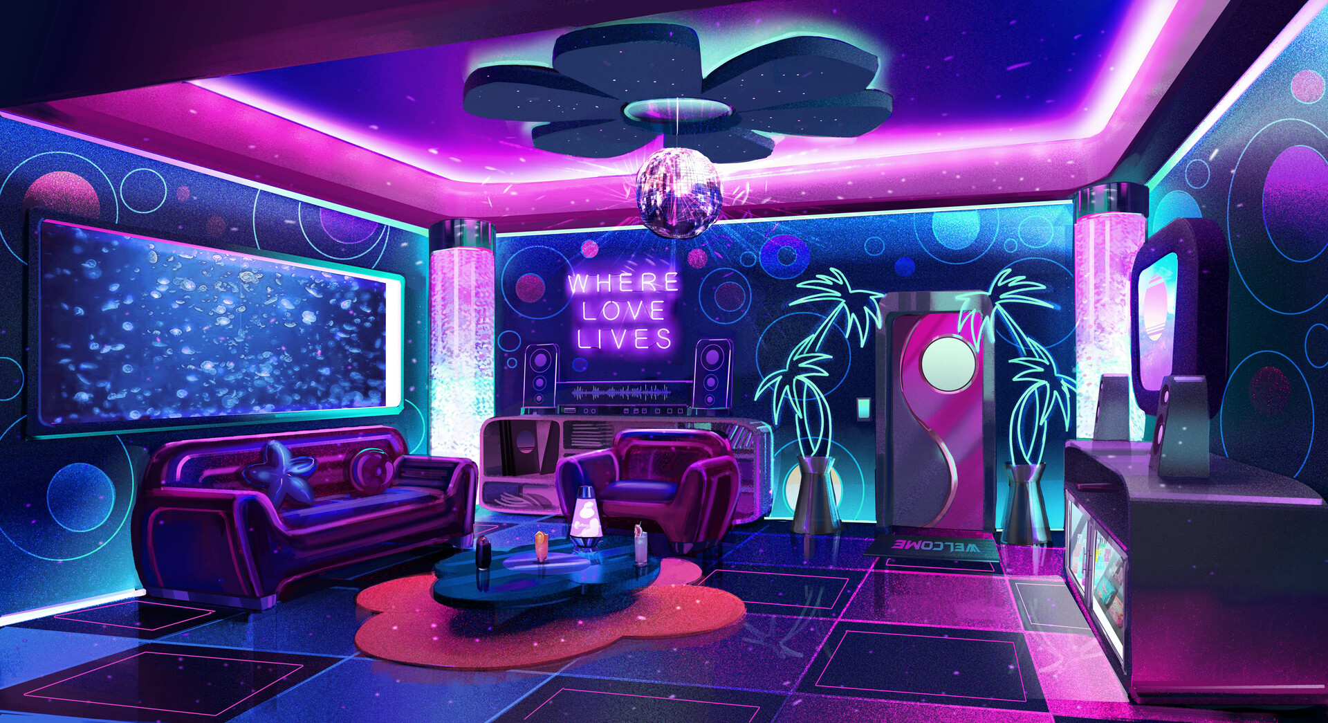
If you were around the internet in 2016, in particular on Tumblr, you will remember the “aesthetic” movement, which has basically been feeding off of these two winning colours since the 2010s. In 2016, subcultural aesthetics such as Seapunk and Vaporwave also saw a massive rise.

Vaporwave in particular stands as a subculture which directly comments on capitalism through its “saccharine caricature of corporate culture,” standing in opposition to what Pantone is doing. Yet even big platforms such as MTV have appropriated the subculture’s aesthetic and rebranded entirely with the Vaporwave colours, although they were eventually met with immense backlash.
Fruthermore, the Rose Quartz and Serenity colours of this subculture are in line with a femme-positive aesthetic which goes against the gendering of colours while implementing the softness of these two colours in order to contest the patriarchy. These are also literally the colours of the Trans flag. Thus, such connotations to these colours are certainly more powerful than Pantone’s mere claims to “wellness,” “peace” and “equality.” Altogether this illustrates that Pantone is perhaps not using its authority as a brand particularly well, by not only blatantly appropriating from subcultures but also by disregarding their ideology in the short and bland description attributed to their 2016 winning colours.
Still, Pantone has not become synonymous with colour and does not own it. But the thought that many design institutions and clothing brands recognise their status could be dangerous with regards to a general politics of ownership. For instance, Adobe have recently announced that they will charge users extra to access Pantone colours. Is it correct for companies to profit off of mere colours? Is there potential for some colours to become unnaccesible unless purchased from Pantone?


Hey there!
Thanks for your post, it was a really interesting read.
I didn’t know about the award, so I also didn’t know about their vote for Rose Quartz and Serenity. I think you’re raising a great point there, especially considering the meaning of these colours in the context of the Trans flag. Do you know how they decide on the ‘colour of the year’?
I did know that they were quite a big number in design companies. The architecture firm I used to work for had them integrated into the CAD and Adobe programs as well, so if I would design the facade for a new building for example, I would always work with them. The fact that they literally opened a hotel and had a collection with Zara is beyond me. How can anyone own a colour?
I’ve never actually thought about how Pantone operates as a company! They’ve had a long-standing collaboration with Korean makeup brand VDL too, where they come out with a new collection of products based on the color of the year. Funny that it’s never crossed my mind until now, thank you for your post!
Thanks this was really interesting! I never knew that they had collaborations with Zara. Their colour of the year definitely has influence on fashion trends, and I wonder what goes on behind the scenes – if colour of the year could be bought out by a designer marketing a specific colour collection. Your post reminded me of vantablack, which is a copyrighted colour but only because the technology to make it is copyrighted
really interesting!
I always thought Pantone was pretty scammy exactly because they are self proclaimed color makers. What does that even mean? And why would they sell colors when one simply cannot own a color…
In some way, pantone (and other companies) are just like influencers as in, they profit off of whatever is relevant in popular culture. Further proving the scammy aspects of the company, lacking creativity and genuine interest.
Really interesting! I have not heard of Pantone before but I am familiar with different companies and their colour-code charts. While working at a hardware store I often had to operate the paint mixing machine which works with the different colour-codes. The RAL system is one of the oldest and well-known and was already developed in 1927. I don’t think this development will continue much further because checking the colour and owner-rights will be too much of a hassle.
Thank you for this post! The questions you ask in your last paragraph reminded me of the Vantablack Contoversy in which artist Anish Kapoor bought the exclusive usage rights of the “blackest black” manufactured by the company Surrey NanoSystems. He was later ridiculed by another artist, Stuart Semple and his Pinkest Pink available to everyone except Kapoor, who had already lost a big part of his charisma in the eyes of the public. I hadn’t yet made the link with the Pantone company: their tactics are not far away from Kapoor’s.
About Pantone’s charging users extra: I think this is an example of company greed (Adobe is already subscription based and far from cheap) and think this move will hurt them in the long run. Pantone promises its users that they will get the same color as the one on the swatch, however one or two extra test printings also yield the same result and the surface you are printing on will always influence the end color be it a Pantone one or not.