In the blog I wrote last week I talked about the fact that the field of studying old cultures is a somewhat old-fashioned one. And while this is accurate for most of the field, there are also some initiatives in the digital world to make (ancient) history a bit more accessible. In today’s blog I want to shine a light on how amazing some of these are! I will do five different bits. I want to definitely encourage you to go to the websites to really look at it yourself and explore them all!
Short disclaimer: you can click on the titles of each bit to get referred to the website.
In modern times, when we visit a museum to see a Greek statue, we see a beautiful and elegant white marble sculpture. But that is not how it originally was. All the things that look so terribly elegant today are, when people see them in their original (coloured) state, considered horrendously tacky (their opinion, not mine). A temple used to greet you with an enormous amount of colour. Scientists nowadays have spent time and effort into showing the public the colourful side of the past. A good example of this is the video from the Getty Museum where they show the process on how to determine the colours that were on the statues. Just Google ‘Greek statue colour’ and you will amazed!
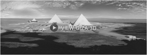
This initiative from Harvard is definitely one to watch. This project had the goal to digitize all of the information they have on the expedition to Giza from 1904-1947. But the project soon spread out even more and now they are even building a 3D virtual reconstruction of the Giza plateau. The project director is Peter Der Manuelian, a prominent Egyptologist. He even wrote a book about the project ‘Digital Giza: Visualizing the Pyramids’ in which he discusses this new mix of digital visualization and archaeology. The website itself is quite impressing. It is very extensive with 3D maps of the plateau, the pyramids and the sphinx.
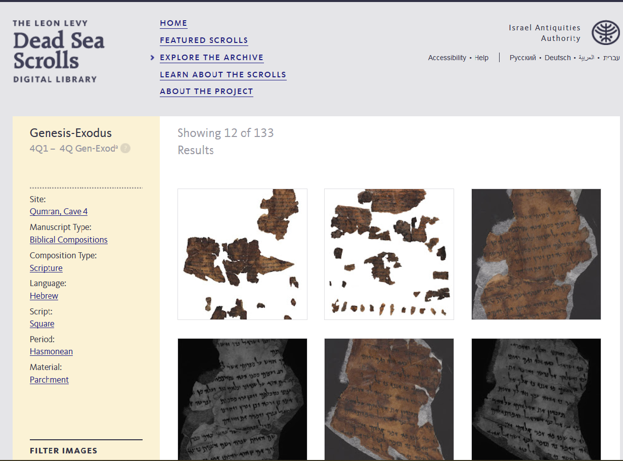
This website is one of my personal favourites. I used this website when I was writing a paper on apocalypticism in the book of Daniel. Some scrolls are featured on the website and the apocryphon of Daniel is one of them. They not only give you the scroll you need (in my case it was one from the fourth cave in Qumran), they even give dates, language and a bit of further information. The only thing that is still missing is a translation. Apparently not everyone is fluent in Hebrew/Paleo-Hebrew/Aramaic…. (very weird).
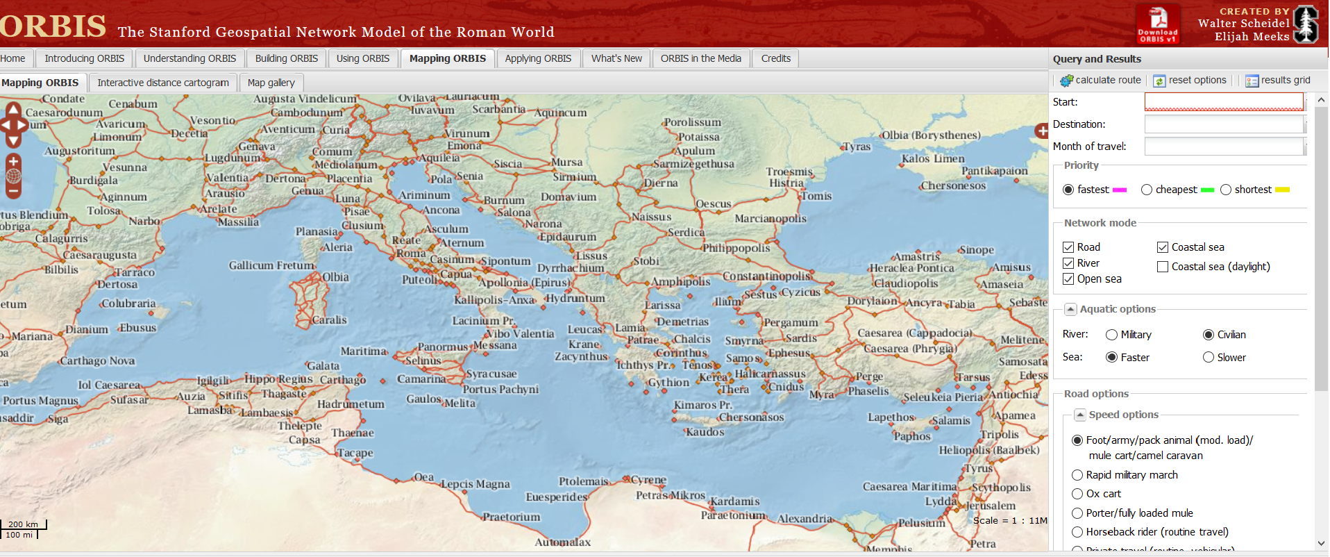
ORBIS: The Stanford Geospatial Network Model of the Roman World. With this model you can actually see how travel worked in antiquity. I ran into this website/model when I was still a student in Utrecht and we had to make a travel journal from antiquity. This model was simply perfect for it. Imagine that you want to know how long it took to get from A to B in the year 200. You fill in a start, destination and month of travel (it even considers that!) and there you go! To make it even more epic (in my eyes) you can choose what you’re priority is. Do you want the fastest, cheapest or shortest route? You can even fill in how you are travelling (rapid military march, fast carriage or by foot). The possibilities are endless. It sure makes you appreciate the public transport we have now.
The model uses Gephi, which is an open graph visualization platform. This open source program helps you to not only make graphs, but also make you explore and understand them. Gephi is widely used in the digital humanities and just looking at ORBIS, you can understand why. Many of the developers also came from the humanities so it truly is made for people studying the humanities.
So there you go, there are a lot of projects that make the humanities (and ancient history) even more brilliant than they already are!


Your blog is so cool and interactive! It’s really cool! Can’t wait for next week!