Do we need more typefaces or individual fonts? As my last blog mentioned – we do a lot of reading on and off screen. Therefore, the background scaffolding to all that content – the type face, type font, and general formatting – is essential design to aid legibility. Typefaces are most often designed to be easy to read. But a recently released type font is designed to do the opposite – it’s more difficult to read.
Sans Forgetica was created by the Behavioural Business Lab and School of Design at RMIT University, Melbourne, Australia, and a multidisciplinary team of cognitive psychologists, typographers to be difficult for a purpose.
As the elevator pitch goes: “Sans Forgetica is a free downloadable font that is scientifically designed to help students to remember their study notes” [1]. The theory is that if some kind of obstruction is introduced into the learning process then the brain has something to work on, learning is deeper, and better memory retention is the result. In this font design, the ‘sweetspot’ of ‘desirable difficulty’ is created by giving letters a 7 degree backslant and scooping out the letters to make gaps. Several designs were tested out on students to find that ‘sweetspot’ between too easy to read or just plain illegible. The font was designed for shorter texts, i.e. study notes. As one of the RMIT’s typographers, Stephen Banham, remarks about putting longer texts in this font (The Guardian article): “God no, you wouldn’t want novels printed in it, it would probably induce a headache”.
On the Sans Forgetica website, Banham further explains the two key design elements used to create the ‘voice’ of Sans Forgetica’; namely, slant and gaps. Slant is usually only seen in print as forward slanting letters in italics whilst the main use of backslanting fonts is to label rivers on topographical maps. Gaps introduced into the letters also break down the conventional reading process. The design of gaps anticipate how people read by first attending to the outline of letters and words and then processing meaning by filling in spaces. Research indicates that these ‘reading obstacles’ of backslant and gaps slow down the reading process and aid memory retention.
Minding the Gap on the London Underground
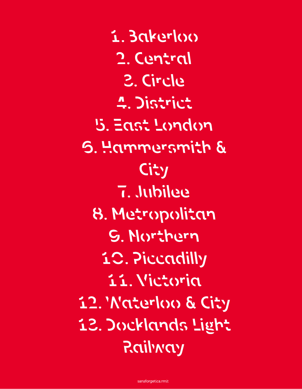
For example, you might want to commit to memory the names of the London Underground Lines:
The famous original Johnston Sans typeface was created in 1916 by Edward Johnston for the better branding and visibility of the London Underground corporation. It was updated in 2016 to commemorate the 100th year anniversary of the Johnston typeface with a digital friendly replacement, called Johnston100. This updated font better suits mobile phones, and includes new characters like hash-tags which were not needed in the original font. Changes are subtle and designed to keep the ‘soul’ of the original typeface.
The proof whether Sans Forgetica helps you not to forget is in the testing, which is a matter of time and study. Perhaps if I’d had this font last year I could have had better success with learning Old English words! So I would say ‘yes’, we can always use a new type to play or do serious study with.
Try it out for yourself. The font can be downloaded for free from https://sansforgetica.rmit/ and, for example, installed in MS Word; or test out on RMIT’s web page itself.
References
[1] Sans Forgetica – RMIT
https://sansforgetica.rmit/
[2] The Guardian: You can read The Guardian article in the font type of Guardian Text Egyptian Web:
https://www.theguardian.com/artanddesign/2018/oct/04/font-of-all-knowledge-researchers-develop-typeface-they-say-can-boost-memory
or the same article again in
Sans Forgetica
https://interactive.guim.co.uk/embed/aus/2018/oct/font-yarn.pdf
[3] List of London Underground stations
https://nl.wikipedia.org/wiki/Central_Line
https://en.wikipedia.org/wiki/List_of_London_Underground_stations#Stations


You picked up on an interesting video here! I’ve always paid attention to the use of different fonts, specifically in my academic work. Changing fonts makes you more tentative (or so it is presumed) and it makes it easier to proofread your work by yourself. Therefore, it wouldn’t surprise me at all if there is some scientific benefit to developing/using Sans Forgetica.