
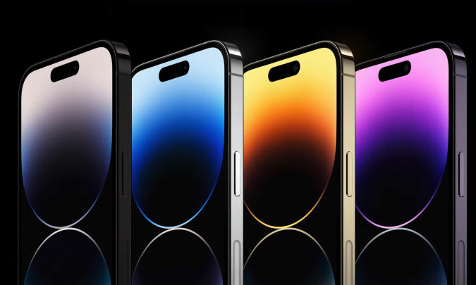
Only a few short years ago, we loved to make use of the freedom that technology gave us to express ourselves. WordArts on your school projects, booming colours on your MySpace and brand ads that had the latest flashy feature. All my music-related devices were blue and white, and if I bought something new it sure as hell was going to be shiny. Everything and everyone had the chance to make everything to their liking, and it was great fun. Then at some point, things started changing, and it got weird.
Technology become more advanced, right?
As more and more people started using technology in some form or another, these unspoken rules developed. We could do so much more with new programming languages, improved hardware and much more tech manpower and knowledge, but what we did with it was a total contradiction. Everything digital needs to be easy to use, streamlined and efficient! Remove more things, and put every necessity in the same place every time. If it looks calm and predictable, people will want to use it more. Keep the visuals simple so your brand name stands out. Not too much choice, the user can’t handle that. It can’t be too different from what they know, or they will get confused and leave. (Stick to what you know, stick to the status quo!) You need to be able to use it in your sleep, if you would want that! (And if you’re me, you accidentally will, way more times than I’d like to admit)
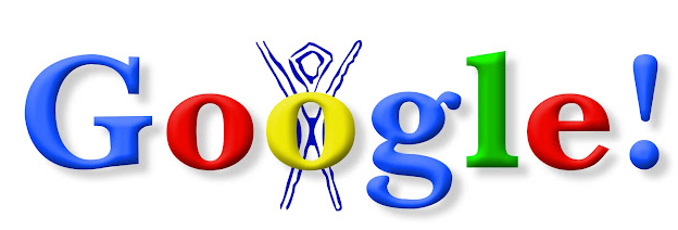
Now, I’m not saying we need to revert back to the style of gems like this eyesore of a website, but when everything is minimalistic, what’s the point of having different brands anymore?
Less is not always more, except for when it is
It’s true, the simple and straight-forward look gives off a certain feeling. This air of cleanliness and quality>quantity is an effective marketing tactic that tells the user the product is simple to buy, use, look at and doesn’t get too bold about anything. Brands enjoy applying this technique to their websites and overall look because it makes everything seem homemade, new, and unproblematic. Just take a look at fashion brands – put a sleek, simple label on something, and immediately it’s seen as more ethical and harmless. Even when it’s not true!
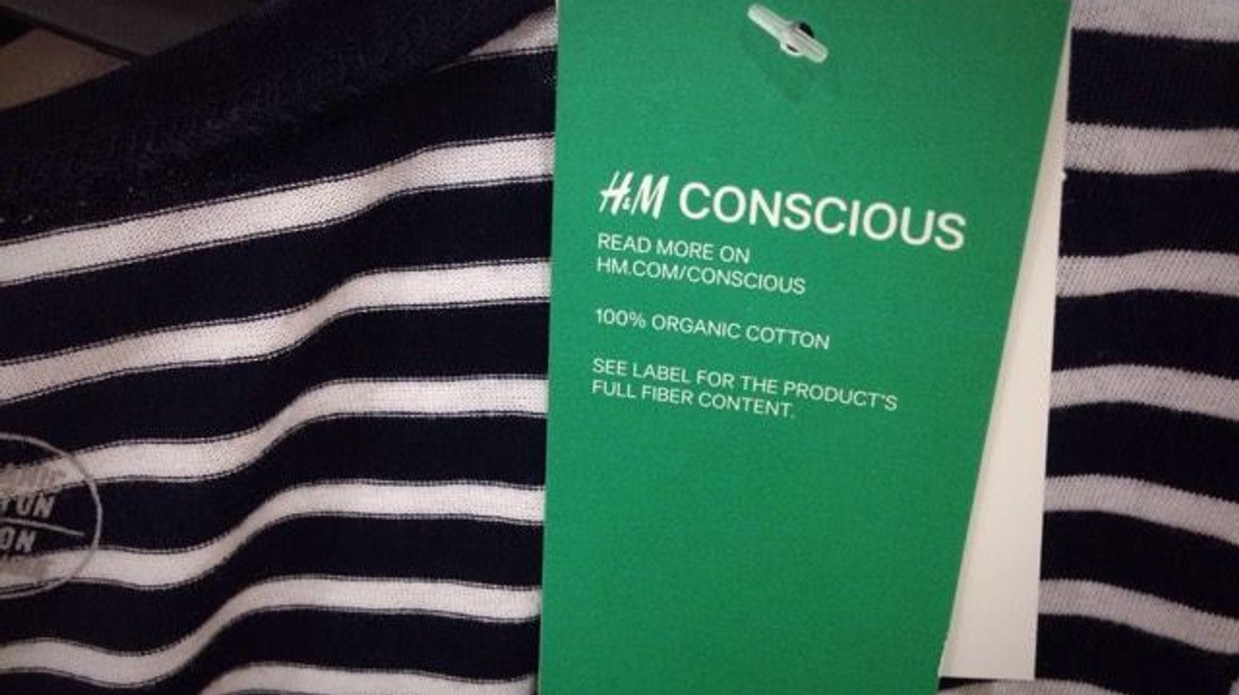
After all, if it looks all that simple, you forget about everything that goes on behind the scenes. Everything from dropshipping to greenwashing to data collection, you’ll forget about it when it all looks so fresh and aesthetic.
It’s so boring.
Not every simplistic thing is hiding something dark, of course. But after seeing every website transform into the style of a modern millionaire mansion, going online no longer feels interesting and friendly.
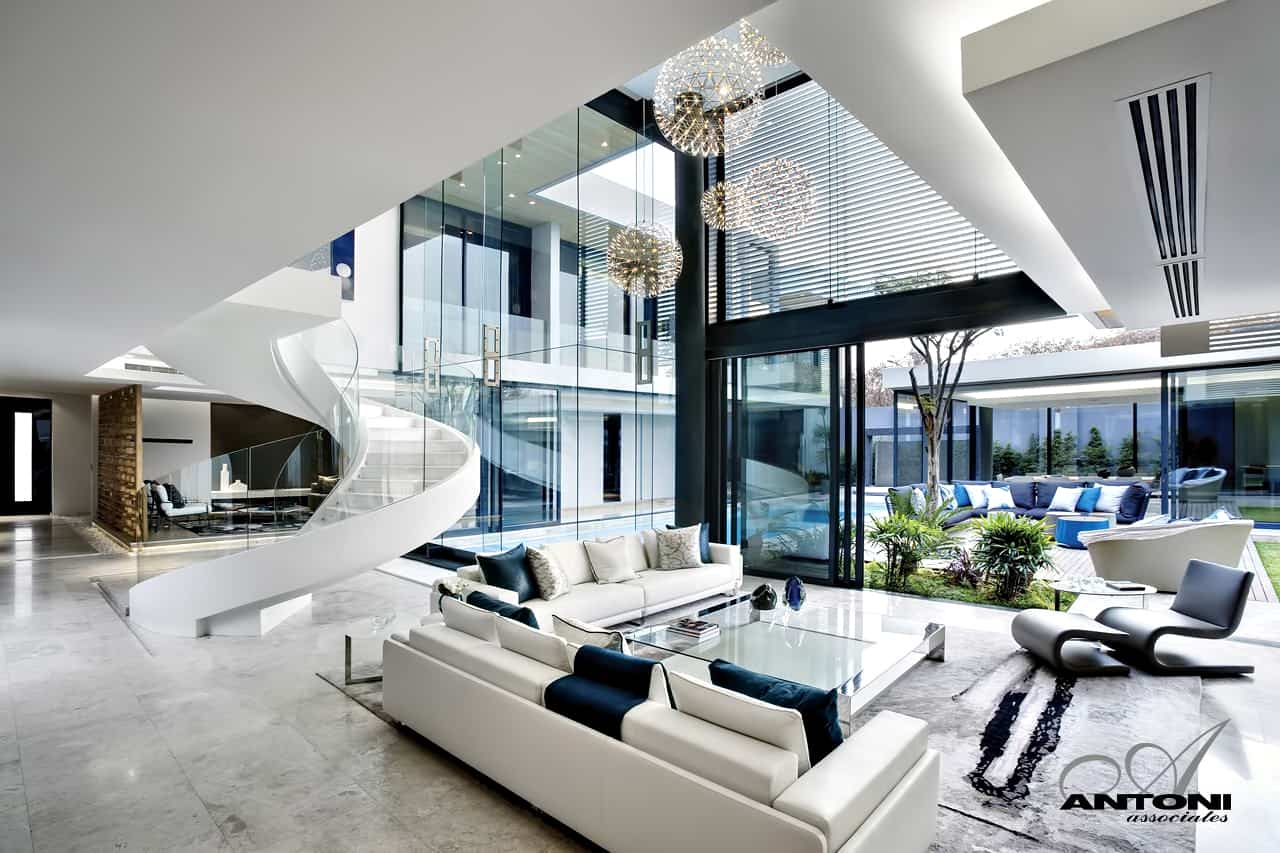
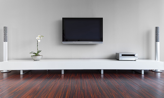
Every brand and big name is trying to be like existing things, and forgets their original charm in the process. When everything from websites to TVs to the online fashion trends is curated with a crisp, sleek look in mind, you lose all personality. With such strict ‘rules’, we reduce the amount of room that there is for creativity, and eventually you run out! I recently talked to someone who agreed with me that we’ve seen it all before, and it kind of feels like there is no new internet to explore because it’s all so similar. If opening my phone starts to feel like the digital equivalent of unseasoned stamppot, I’m not going to bother with it anymore. Maybe it’s time to consider exploring the dark web next, who knows, it might not be bland yet.
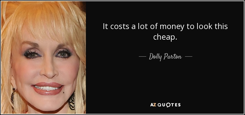
Image sources
https://www.engadget.com/how-to-pre-order-apple-iphone-14-iphone-14-pro-apple-watch-ultra-apple-watch-series-8-airpods-pro-2-183856500.html
https://nl.m.wikipedia.org/wiki/Bestand:Instagram_logo_2022.svg
https://www.cubicleandoffice.com/products/wall-mounted-flat-screen-tvs https://thesustainableagency.com/blog/greenwashing-examples/
https://luxatic.com/incredible-modern-mansions/
https://www.azquotes.com/quote/225661


I love this! You did such a good job expressing yourself and I couldn’t help but agree! I do find the minimalist aesthetic pleasing sometimes, but there is always a limit and I do miss the flashy, shiny logos and eye-catching websites as well! Enough is enough and with fashion trends going in a circle, fingers crossed that the same will happen with internet!
Oh I agree, it is pleasing! But sometimes you just want something more than sauceless sans-serif fonts on a monochrome background, and I’m glad someone agrees 🙂
loved the comparison between minimalism and unseasoned stamppot. We are definitely in need of a digital maximalism revolution
I can’t even imagine what could happen if things were not so simple and neat. I recognise the simplicity trends and don’t like them necessarily but to be honest, I do find a lot of what is out there already. But if we follow how the trending years come back, we are again in the 90s somehow. I would guess in a few years we might be back to the 20s.